- Candee - Mobile Surveys & Desktop Customization Site (2020) -
Engagement & Enrichment taken to the next level
Candee was a mobile solution that strived to make taking surveys fun & painless. It was designed as a white label recruiters could use to automatically engage with job applicants the second a new job application is received using a text or WhatsApp message with a dedicated link. The goal was to collect important data the recruiters could use in order to determine if the applicant is a match before the preliminary call or email, using a fun, innovative & illustration rich user interface for the users, and an intuitive desktop platform the end users could use to customize the surveys. My role was to research, design and test all UIs related to the project. I collaborated with my junior UX/UI designer, product management and engineering to launch a working demo our management used to test the technology with potential clients.
UX/UI: Gianfranco Azzaroccini | Illustrations: Liran Tsach | Product Manager/CEO: Ron Starinsky


Discovery | User Testing
How to ask questions job applicants will want to answer.
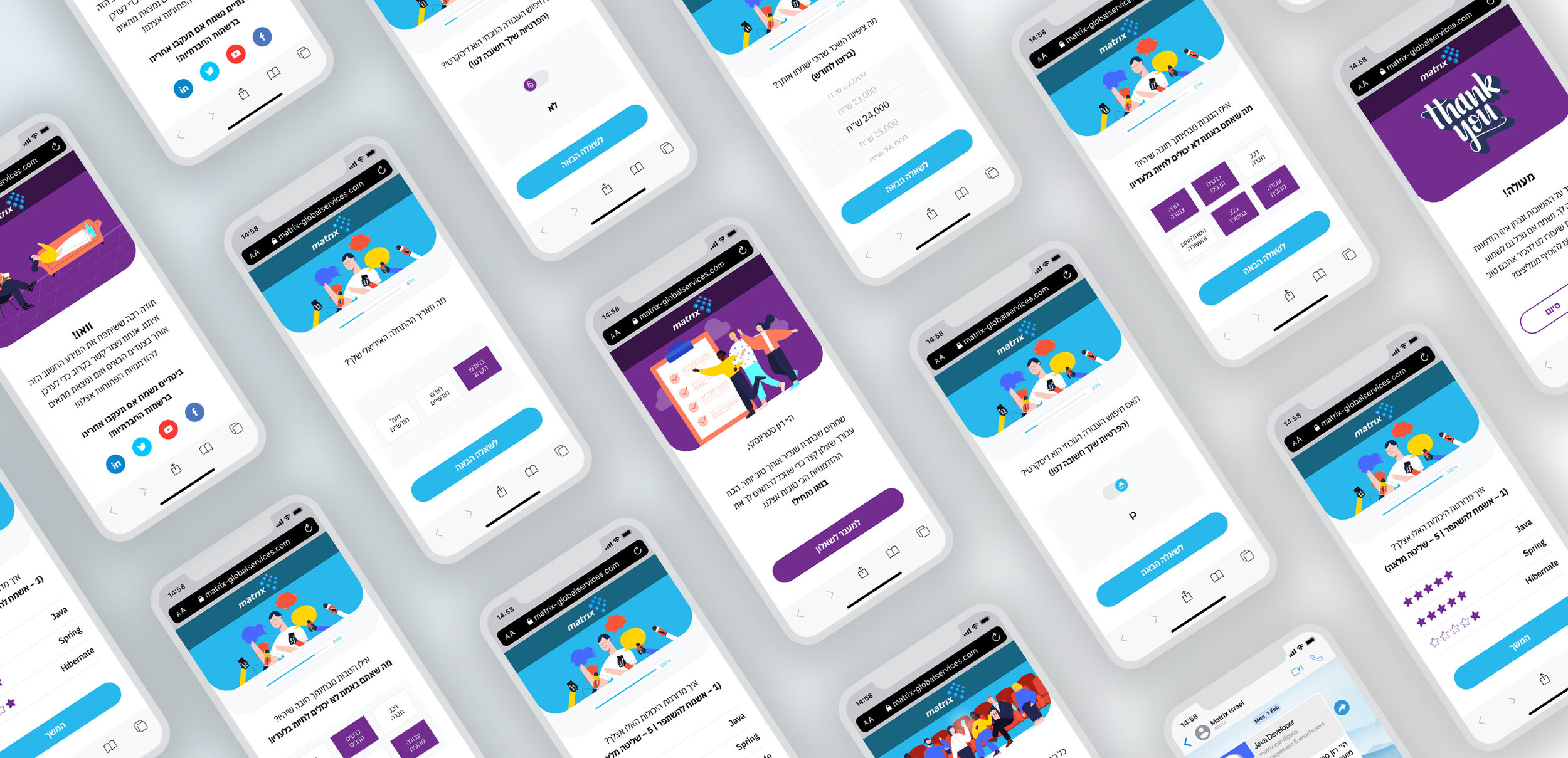
Israel employs the highest number of scientists per capita in the world, and it competes internationally in terms of innovation. With a highly-motivated and talented workforce, the Israeli IT job market is extremely competitive and consists of roughly 124K employees. Like all of ICV’s products, Candee was designed to cater for developers in the IT market, the 4th biggest in the world, and was intended to focus on 2 main user personas: Fresh & Existing job applicants. A 2019 study showed a 70-30% gender division in favor of men, Most of them with a B.Sc and also showed a large presence to former military cyber division personnel. Taking all this data into consideration and after getting the different survey flows from the PM, I divided the answers into archetypes and created dedicated templates for each answer type. This included: Range, Date, Boolean, Rank, MultiChoice, MultiSelect & Number answers. I created 2 options for each template and tested it internally with 5 users to determine which is more effective. Another important factor we needed to understand is how many questions could be asked before the users lost patience and abandoned the survey. The tests helped identify usability issues and find ways to make the process more engaging.

Discovery |
Competitive Research
Discovering the elements that make a great survey app.
The research for this project included both online survey solutions and website template customization tools. There are quite a few players in both fields and lots of great examples on how to do it right in addition to clear examples of what to avoid. What I realized is that a good survey app will allow you to completely customize each question, so you can ask for information in a way that makes sense to the people answering it. The dissection of questions and answers into their basic elements was an amazing challenge to solve in the UX of both ends and I thoroughly enjoyed exploring the different approaches used with the different solutions I researched. Obviously, the most effective platforms were intuitive, & easy to use and work with. I narrowed down the focus of my research to the top 3 players in each field.

Design | Wireframes
Finding the right balance
After distilling the research I started out by creating low fidelity wireframes & mockups to think through the structure of the survey and the customization platform. This was the stage I decided the surveys needed dedicated space for illustrations to improve user engagement. Most of the surveys I saw were dry, text only depressing entities and I really needed Candee to set itself apart from the competition. I used Adobe XD to iterate through the design process. Working closely with the product manager, the CBDO and my junior UX/UI Designer, we used the wireframes to discuss product strategy.

Asking the questions your users want gets the data they need.
Finding ways to organize the structure of the survey customization platform in a way that was both intuitive and multi layered proved to be a huge challenge I enjoyed iterating with and test in order to achieve optimal results.
Design |
Prototypes
Bringing the surveys to life while constantly iterating and improving the experience
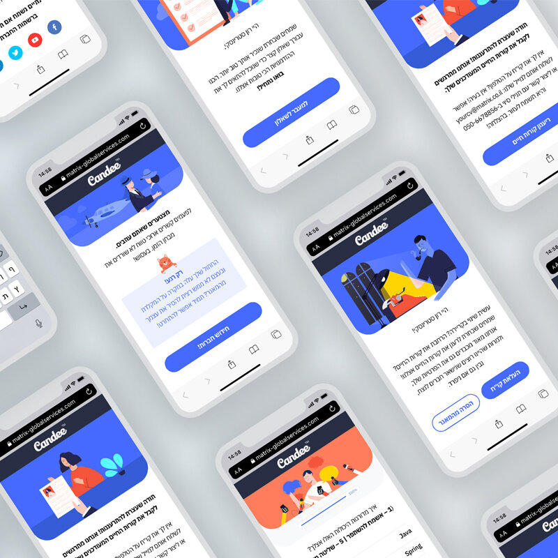
There’s nothing I love more than turning wireframes into high fidelity prototypes. Testing out optional color palettes, experimenting with textures, illustrations, button shapes and elements, letting the users play with the different options, and ultimately getting their super valuable feedback that was always eye opening, crucial and important. I created the prototypes with Adobe XD. Collecting the valuable user feedback really helped us understand which design option would work best, which color palette proved more engaging, and which illustration style tested better. Out of the 3 options tested, The dual color Rounded Corner option won by a landslide. Candee’s surveys would be completely customized to match each client’s color palette and specific needs.
- Candee in action -
A positive experience from the get-go
Job applicants are a captive audience. If you apply for a job and get an instant reply from the potential employer, on your phone, via text message or WhatsApp, asking you to answer a few questions, chances are you’re going to take the survey. My goal was to make the experience as positive and easy as possible, in order to get optimal results and decrease survey abandonment.

- Candee Customization Site UX | Desktop Overview
Testing out ways to organize the structure we needed to enable maximum flexibility
The customization site needed to be easy to use and allow our users to create the exact surveys they need. I created this flow mockup to demonstrate the direction the site could take


What I learned
Working on Candee was a great opportunity to learn about the online survey world. How to ask questions users will want to answer, how to engage in a way that’s not intimidating, finding ways to decrease drop off rates and improve user cooperation. The most challenging part of the solution was the customization site. I learned how to deconstruct questions, find ways to allow maximum flexibility in constructing totally new questions we never thought about, and create an overall positive experience for a captive audience, this time with the local market in mind. I enjoyed working with the front end developers, making sure the product maintained its pixel perfect design and created a design system that was constantly updated and shared with the stakeholders.

Insights
During the user research process I was surprised to find out that most test users preferred a progress bar with a completion percentage to pagination. The drop off rate on the progress bar options was significantly lower. Another important factor was the ideal number of questions users wanted to answer before becoming frustrated. We tested surveys with 5-7 questions, 8-10 and 11-13. Drop off rates for the latter two were surprisingly high, a factor that affected all future flows and our approach to the surveys look and feel.

Main Challenges
The main challenge I had to solve was how to make a boring task like answering a survey- engaging, light and fun. In order to achieve that I had to make sure the questions can be easily answered, using the most user friendly & common approach. I used vibrant uplifting color palettes and dedicated plenty of space for fun illustrations to keep the users engaged. An important factor that improved the experience was the understanding users need to know the end point is near. For that reason I placed the progress bar high in the hierarchy. These steps proved themselves as the drop off rate of the final version was only 7.1%. The Customization site's main challenges were figuring out how to completely deconstruct and assemble questions, how to organize a super complicated system in a way users would find easy to work with. And finally, allow maximum flexibility for the users to express themselves and their specific needs. I combined a few approaches to solving this and began initial tests to understand which direction proved more effective.